Making Science Visible
/Bringing Ecology into Art
Making art to help the environment is tricky because no one likes being preached at. One effective way to convey the reality of our current state to is to incorporate accurate scientific information into the images without letting it take over the art of the piece.
This was done elegantly by Ziegler as shown in my post on the plastic bag whale. But I found it not so easy to do when I tried it this last fall.
In Lisa Call’s ‘Working in a Series’ online class, I gave myself the assignment of including a whale and a boat and something about science in every piece. When Ziegler showed pollution by designing a whale of actual plastic bags, she’s showing us what’s going on. But when I wanted to include in measures of climate change like temperature, pH, and CO2 levels they are more abstract than plastic and well …. that was tougher.
Tell Me - Digital Data
In my first piece, As Above . . . , I just plunked ocean data at the bottom of the image.
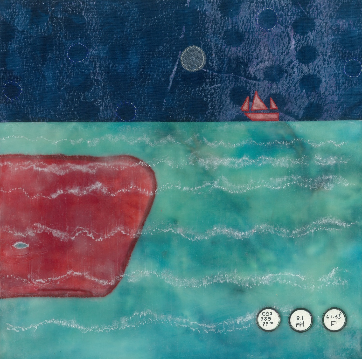
Reardon (c)2014 As Above . . .
Not so complex. But both hard to see and not very subtle. In later pieces, I worked at integrating various science elements more fully. For example, in Atmospheric Jolt I worked the CO2 formula into the whole piece, echoing how CO2 moves in both the air and the sea.

Reardon (c)2014 Atmospheric Jolt
At an even more abstract level, different types of data are related in graphs, diagrams and mathematical formulas. Throughout the class, I experimented with these, including graphs and tables showing numbers of endangered whales.
Show Me - Analog Images
It wasn’t until my final piece, that my intuition kicked in. I imagined from the research how sperm whales’ social echolocations would look. I created an image showing the relationships in an analog way rather than with the digital data of sound frequencies.

Reardon (c)2014 Lady Madonna
Without intention, I’d crossed over into the realm of symbols by using the ‘halos’ of intersecting circles. Symbols, unlike the specific information of science, invite multiple associations not fully known. Certainly the association to something a bit holy was not known by me as I worked. Now I’ve titled the piece Lady Madonna (favoring the associations to the Beatles song over those to Renaissance art or the star of Evita).
Over the course of the class, I came around from science’s simple numbers laid onto the art to letting the social science of whales emerge from the image. I’m partial to the second style but am always interested in other examples of how science makes its way into art. You can share your favorites (even anonymously) under comments below.
